An Autonomous Institution
Accredited by NBA(CSE, ECE, EEE, MECH)
AICTE Sponsored Margdarshan Mentor Institution
DST-FIST Supported Institution | ISO 9001:2015 certified
Recognised Under Section 2(f) & 12(B) of the UGC Act,1956
103/G2, Bypass Road, Vannarpettai, Tirunelveli, Tamil Nadu, India - 627003.
In the fast-paced world of business, making informed decisions is paramount to success. With the advent of big data, organizations have access to more information than ever before. However, this abundance of data can be overwhelming without the right tools to analyze and interpret it. This is where data visualization comes in.
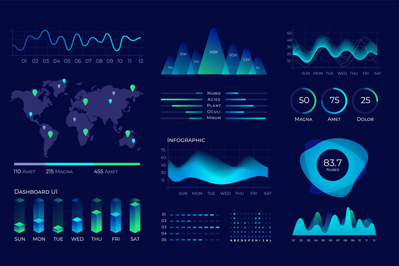
Data visualization simplifies complex information by converting data into visual formats such as charts, graphs, and dashboards. These visual representations make it easier for users to interpret data, identify trends, and draw insights. By presenting data visually, organizations can communicate complex information more effectively and facilitate quicker decision-making processes. Visualizations help in highlighting key data points, comparing different datasets, and identifying patterns that may not be apparent in raw data. This simplification of data allows stakeholders at all levels of an organization to understand and act upon information more efficiently, leading to more informed decision-making.
Data visualization has evolved from simple charts and graphs to dynamic, interactive dashboards, revolutionizing how we understand and interact with data. In the past, static visuals provided a basic overview, but today's tools offer immersive experiences. Interactive dashboards allow users to manipulate variables, drill down into details, and uncover insights that were once hidden in static charts.
This evolution has been driven by advancements in technology, particularly in data processing and user interface design. Modern data visualization tools leverage these advancements to create engaging and informative visualizations that cater to a wide range of users.
As a result, decision-makers can now explore data more deeply, make informed decisions more quickly, and communicate insights more effectively. This evolution continues to shape the field of data visualization, opening up new possibilities for how we analyze and understand data.
Selecting the right data visualization tool is crucial for effectively communicating insights. Several factors should be considered when choosing a tool for your business needs. Firstly, consider the type of data you're working with. For example, if you're dealing with geospatial data, a tool that specializes in mapping may be more suitable.
Secondly, think about your audience and the level of interactivity required. If you're creating interactive dashboards for business users, a tool with robust dashboarding capabilities would be ideal. Additionally, consider the scalability and compatibility of the tool with your existing systems.
Effective data visualization is crucial for communicating insights clearly and persuasively. To achieve this, it's essential to follow several best practices. Firstly, choose the right type of visualization for your data. Bar charts are ideal for comparing values, while line charts work well for showing trends over time.
Secondly, keep your visuals simple and uncluttered. Avoid using too many colors or elements that can distract from the main message. Use color strategically to highlight key points and create visual hierarchy.
Thirdly, provide context for your data to help viewers understand its significance. Use annotations, labels, and captions to explain the data and provide additional insights.
Lastly, consider your audience and tailor your visualizations to their needs and level of expertise. By following these best practices, you can create visualizations that effectively communicate insights and drive informed decision-making.
Color plays a significant role in data visualization, influencing how data is perceived and understood. Understanding and applying color theory can greatly enhance the effectiveness of your visualizations. Firstly, use colors that are easily distinguishable to avoid confusion. Consider using a color palette with contrasting colors for different data categories to ensure clarity.
Secondly, use color to highlight key data points or trends. By using a bright or contrasting color, you can draw attention to important information and make it stand out.
Additionally, consider the psychological effects of color. For example, warm colors like red and orange can evoke a sense of urgency or importance, while cool colors like blue and green can create a sense of calmness or stability.
Overall, using color effectively can make your data visualizations more engaging, easier to understand, and more impactful.
Data visualization is transforming business intelligence by making data more accessible, understandable, and actionable. Traditional methods of data analysis, such as spreadsheets and reports, are being replaced by interactive visualizations that allow users to explore data in real-time and gain deeper insights.
One key way data visualization is transforming business intelligence is by enabling faster decision-making. With interactive dashboards and visualizations, decision-makers can quickly identify trends, patterns, and outliers that may not be apparent in raw data, leading to more informed decisions.
Additionally, data visualization is democratizing access to data within organizations. Non-technical users can now easily create and interpret visualizations, reducing the reliance on data analysts and empowering teams to make data-driven decisions.
Overall, data visualization is revolutionizing business intelligence by providing new ways to analyze and interpret data, leading to improved decision-making, increased efficiency, and a competitive advantage in today's data-driven world.
Data visualization plays a crucial role in data-driven decision-making by helping users understand complex data sets and extract valuable insights. By presenting data visually, decision-makers can quickly identify trends, patterns, and outliers that may not be apparent in raw data. This enables them to make informed decisions based on data rather than intuition or guesswork, leading to better outcomes for their organizations.
Furthermore, data visualization facilitates communication and collaboration among stakeholders. Visualizations make it easier to share insights and findings, ensuring that everyone is working from the same information and helping to build a consensus around key decisions.
Overall, data visualization is an essential tool for organizations looking to leverage their data to drive informed decision-making. By making data more accessible and understandable, visualization empowers decision-makers at all levels to make better, data-driven choices that lead to improved performance and business success.
In conclusion, data visualization plays a crucial role in business intelligence by simplifying complex information, enabling data exploration, facilitating data-driven decision-making, improving communication and collaboration, and driving business growth and innovation.
By presenting data visually, organizations can communicate insights more effectively, leading to quicker and more informed decision-making processes. Data visualization also promotes collaboration and alignment across teams, as visualizations can be easily shared and understood by all stakeholders.
Additionally, data visualization enables organizations to identify emerging trends, predict customer behavior, and spot market opportunities, ultimately driving business growth and fostering innovation.
As organizations continue to collect and analyze large volumes of data, the importance of data visualization in business intelligence will only continue to grow, helping organizations stay competitive in today's data-driven world.

Author
MADHU VARSHA M C - CSE
2024-02-24